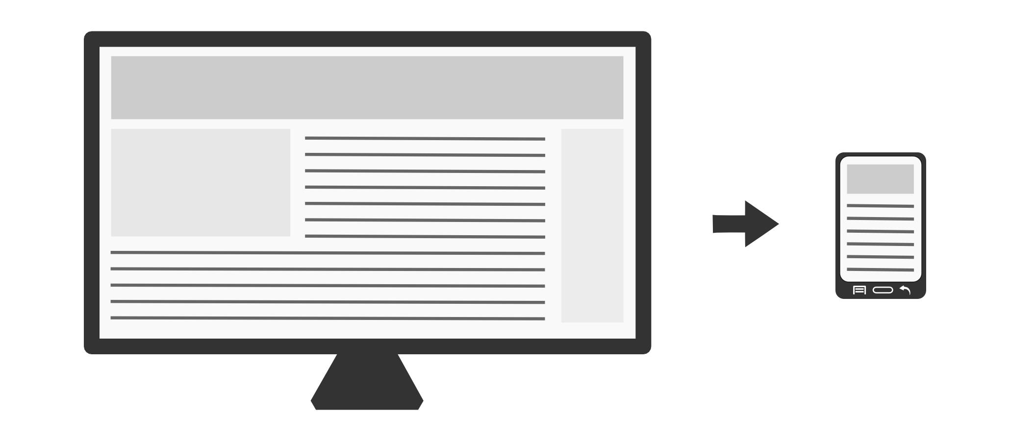
Responsive simply means that a website “responds” to different screen sizes by displaying elements differently depending on the screen resolution. To make a website responsive, you need to add CSS targeted media queries.
A responsive website can be created (or modified) by using targeted media queries. These queries allow the website to change how the content looks depending on the screen resolution. A prerequisite to do this is to know a little bit of HTML and CSS.
An example is often easier to understand a concept. Let’s say you want to make a website which features a side panel and a main content area. You would like to display the side menu only to your desktop users, but show only the main content to your mobile users. Your HTML would look like:
|
1 2 3 4 5 |
<div id="side-panel">Here is my beautiful side panel</div> <div id="main-content"> And meet my awesome content! ... </div> |
Your CSS would then look like:
|
1 2 3 4 5 6 |
/* Phone and tablets */ @media only screen and (max-width: 801px){ #side-panel{ display: none; } } |
Note the “@media only screen and (max-width: 801px)”. That means “when the maximum width of the screen is 801 pixels (a common screen size for tablets), use the rules within the CSS block”. Those rules are only evaluated on screens that are less than or equal to 801 pixels. A full responsive website would include many rules that tweak the user experience for smaller screen sizes. Some of these rules include:
- Using largerfont sizes.
- Hiding / replacing parts of the page.
- Stacking columns into rows.
- Making buttons, forms and links bigger (remember that a finger is much larger than a cursor!)
- Presenting the user with collapsible menus.
For more in targeted media queries, here’s a good technical introduction.
Also, you will want to have a way to give smaller images to your mobile users. See jQueryPicture.
The pros of a responsive website
Since 2014, there are more mobile users than there are desktop users.
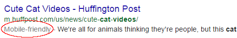
If your website is not responsive, your website is getting a lower rank on search engines. This has been confirmed by Google.
But most importantly, you are providing a non-optimal experience the majority of your users!
Can we help you?
At MasseranoLabs we specialize in mobile websites and responsive layouts. We are always looking for new exciting work. Feel free to ask us for an estimate and we’ll get back to you as soon as possible!