There are two ways you can go about converting your website to mobile: add a responsive layout or create a separate website. Each choice has pros and cons that need to be carefully evaluated in order to avoid overhead costs and headaches. Creating a separate website is going to be easier, but a responsive layout might be the better choice.
How to do the conversion
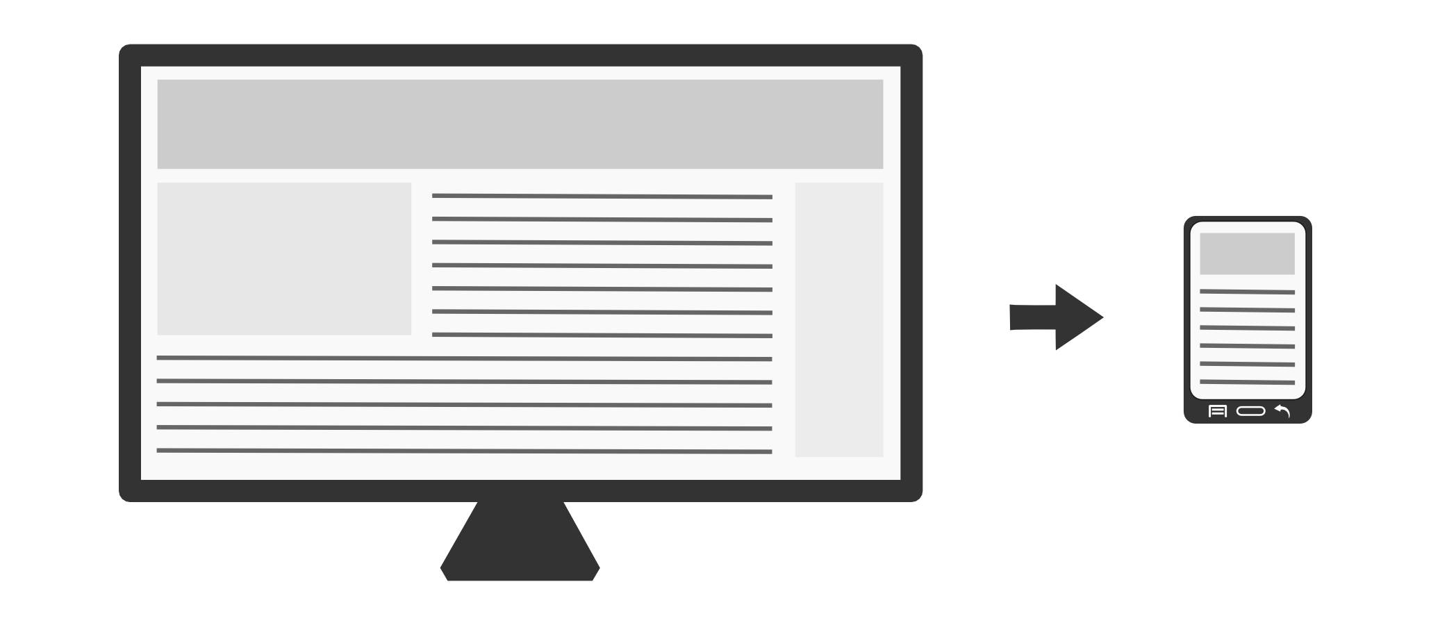
The biggest difference between a desktop computer and a mobile device is screen size. To convert a website to mobile you need to change how the website looks on small screen sizes. You want to trim some content, by showing to your mobile users only the most important parts of the website. You also want to make your images smaller in order to increase the speed of your website (since a lot of mobile phones do not always have a fast internet connection).
You can choose one of two ways to convert a website to mobile:
- Use a responsive layout approach. This is simply a modification of your existing website to support different screen sizes, smaller images and display fewer content. The website will “change” its look depending on the size of the screen that it’s currently viewed on.
- Create a separate website specifically for mobile users. This is an entirely separate website and users are redirected to it if they are using a mobile device.
Here are the differences:
| Pros | Cons | |
|---|---|---|
| Responsive layout | You keep a single website. You don’t have to worry about consistency issues between the desktop and mobile version when adding a new page or new content. | Making a unified experience for both mobile and desktop users can be challenging. For some websites it’s not even an option. Since a full version of the website is always sent through the internet, certain speed optimizations can be difficult or impossible. |
| Separate website | You can tailor the mobile experience of your users without ties to the desktop version. Sometimes users on mobile devices want to accomplish different tasks compared to desktop users. For example, on a bank website users are unlikely to start a loan application. It’s more likely that they want to check their account balance. | You now have to deal with two separate websites. If you update one, you have to make sure that the content is consistent in the other. |
Can I do it myself?
It depends on your skills and your approach, but yes, there are some ways you can do it yourself. Let’s see the two cases:
Case 1. Responsive layout
A responsive layout is achieved by using targeted media queries. These queries allow the website to change its look depending on the size of the screen. You will need to know how to use CSS, HTML and sometimes little bit of JavaScript.
Let’s make an example:
You have your desktop website, which features a side menu and a main content area. This works fine on your large desktop screen, and perhaps even on your tablet. What about on a mobile screen? So you decide the setup your responsive layout using the following rules:
- When using a desktop or tablet, show the side menu.
- When using a phone, hide the side menu and show a button to expand the menu upon request.
You would have something like this in your HTML:
|
1 2 3 4 5 |
<div id="side-menu">Here is my awesome side menu</div> <div id="content"> <button id="show-menu-button">Show Menu</button> ... </div> |
And you would create media queries as follow:
|
1 2 3 4 5 6 7 8 9 10 11 12 13 14 15 |
/* Default */ #show-menu-button{ display: none; } /* Phone portrait */ @media only screen and (max-width: 481px){ #side-menu{ display: none; } #show-menu-button{ display: block; } } |
Note the max-width expression. That translates in “when the maximum width of the screen is 481 pixels (a common size for phones held in landscape orientation), apply the rules contained within the brackets”.
For more in targeted media queries, here’s a good technical introduction.
In addition to the responsive layout, you will want to have a mechanism to serve smaller images to mobile users. See jQueryPicture.
Case 2. Separate website
If you do not know how to code and you want to get started quickly, I recommend trying a mobile website builder. They will take your existing desktop website and attempt to generate a mobile version that you can tweak to your liking. You will have to pay some fees for the service, however. Here’s a quick list of them:
- www.dudamobile.com
- www.weebly.com
- www.strikingly.com
- www.gomobi.info
- www.activemobi.com
- www.mobdis.com
- www.zoho.com
On the other hand, if you are comfortable with CSS, HTML and JavaScript, there are many frameworks out there that can greatly facilitate your task of creating a mobile website. Some of my favorites are Bootstrap and Foundation.
Keep in mind these rules when building a mobile website:
- Design with a user-centered approach. How are users going to interact with the mobile website? What’s important to them? Do not assume that users will interact with your mobile version the same way they interact with the desktop version.
- Always include a link to switch between mobile and desktop site. By convention, the link should be placed at the bottom of the page.
- Trim, trim and trim some more. If you have a lot of content, collapse it or hide it entirely. See how Wikipedia does it (open the link on a mobile device).
- Make your mobile website available as a subdomain. By convention, you should use the “m” subdomain, like in m.myawesomecompany.com.
The benefits of converting to mobile
Since the beginning of 2014, the number of mobile internet users has surpassed that of desktop users.
- If your website doesn’t display nicely on mobile, you are giving a sub-par experience to more than half of your users.
- You are also penalized in terms of ranking on search engines. When people search from their phones and tablets, search engines know which websites provide a mobile-ready experience and tend to rank those websites higher than those who don’t provide mobile-readiness. This has been confirmed by Google.
Re-design or convert?
Depending on the existing layout of your website, one thing that you might want to consider is to simply have your website re-designed from scratch. There are some layouts that are particularly difficult to adapt to mobile, and in those cases, the cost of a conversion can cost just as much as a new design. In that case, you might want to simply take the opportunity to refresh the look of your website by having it re-designed.
Especially if you are on a budget, make sure you don’t get sold a new re-design when all you really needed was a simple conversion! A lot of companies out there would love to make the most money by suggesting you that the website has to be re-designed from scratch! Ask multiple opinions and decide accordingly.
Do I need separate versions for Android, iOS, etc.?
Generally a website that is properly designed to work well on modern mobile devices will not need to be adjusted for different platforms. So no, you will not need separate versions.
What About Fonts?
While mobile users might benefit from a more “mobile friendly” font face like Droid Sans, usually a unified font face between your desktop site and your mobile site will be a better option. The one thing you should care about is the font size. On mobile you might want to use bigger font sizes to make up for the smaller display.
Optimize Google AdSense
If your site displays Google AdSense advertisements, make sure that Google is serving you ads that display nicely on mobile (banner size of 320×50 usually works best). If not, you will have to generate new code snippets from the Google AdSense console for your mobile site.
How much would it cost to have a professional do it?
It depends on the website. Adding a custom responsive layout to an existing website can cost anything from $950 to $10,000+. Certain layouts are easy to scale down, like a grid layout with little or no graphic elements. Others, like fixed layouts with pixel perfect graphics require more work. So it is essential to examine the existing website in order to provide an accurate estimate.
Ask for an estimate
Simply send the URL of your existing website. It should be sufficient for a company to provide you with a preliminary estimate and give you an idea of the price range. Make sure you specify which approach you are interested in using: responsive layout or a separate website.
Remember the pros and cons of a responsive layout vs. a separate website. The wrong choice could lead to unnecessary costs and headaches. If you don’t know which approach would work best, ask the professional!
Get in touch
At MasseranoLabs we specialize in website conversion to mobile, and we are always looking for new exciting work. We have been designing and coding mobile websites from scratch since 2009. Feel free to ask us for an estimate and we’ll get back to you as soon as possible!